The success of your website depends not only on its content and overall aesthetic, but also on its ability to adapt to various devices used by your users. Neglecting its responsiveness to different devices can significantly decrease your engagement rates.
While this proactive approach is essential, it's because it ensures an optimal user experience and significantly increases your visibility on search engines. So, if your website doesn't meet the criteria of responsive design, let us enlighten you on how to implement it.
In this article, we offer tips and advice that concern both website creators and their users. Want to implement responsive design? Read this article, then contact us.
What is responsive design?
Responsive Web Design (RWD) refers to a design that is reactive, adaptive, or responsive. Its meticulous planning in the early stages of web design is a highly strategic step. In reality, although it's about design fundamentally, the issue goes beyond aesthetics.
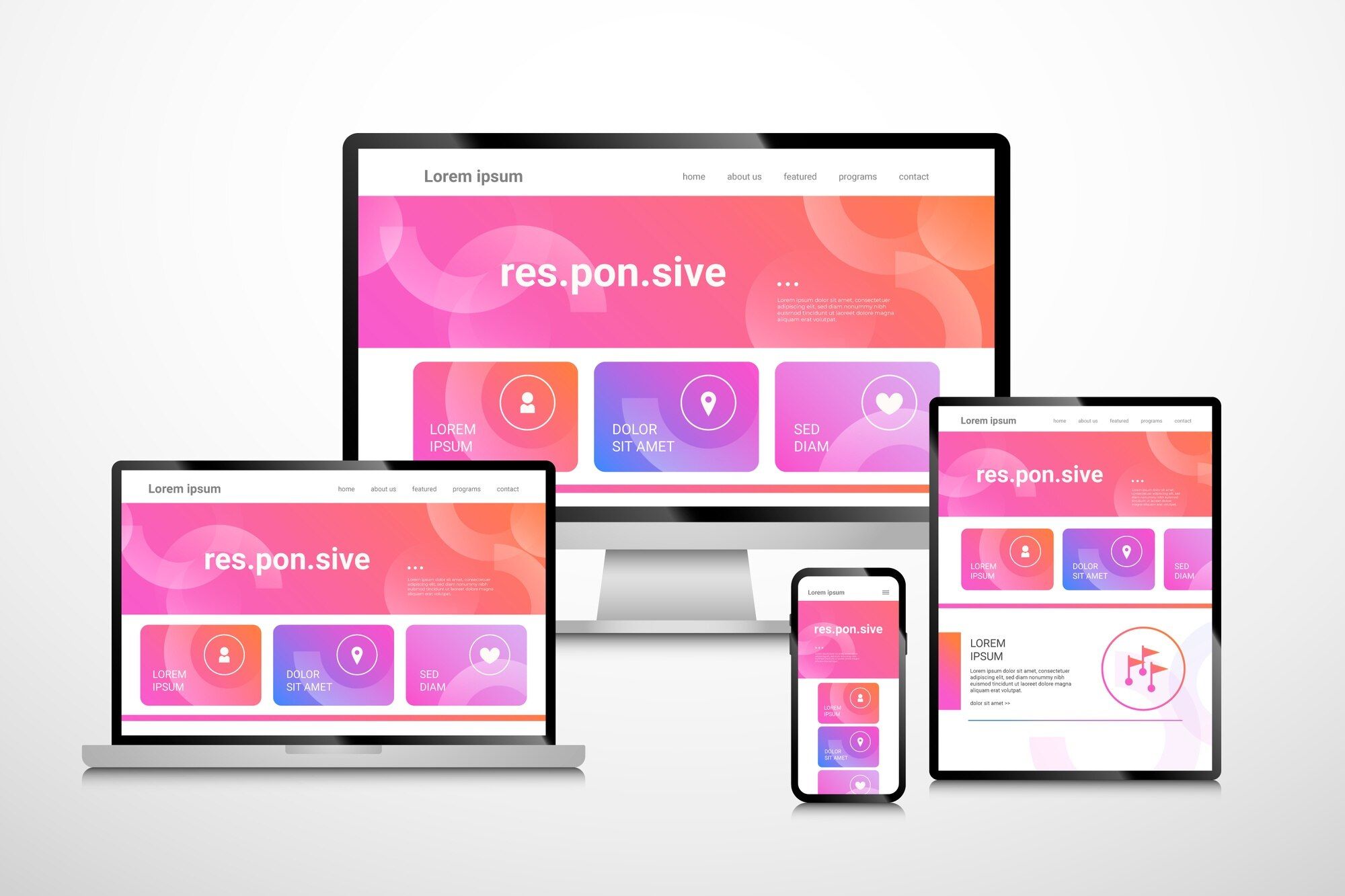
Responsive design first arises from ergonomic concerns; its importance is practical and functional. Its main function is to ensure flawless accessibility for all users, regardless of the devices they use to access your website (computers, tablets, mobile phones...)
A responsive web design displays layouts tailored to different resolutions, different screen sizes. In other words, content blocks (texts, images, videos...) are resized and reorganized based on the width and height of the screen used, for example a mobile device.
Is Responsive Web Design that important?
In short, the answer is yes. Now, let's delve into the details.
UX/UI perspective
- The fluidity of navigation and transition between different screen sizes provide essential comfort to your users. Think about them; spare them from visual distortions, inconvenient horizontal scrolls, or truncated elements.
- Web accessibility is now at the heart of any successful user experience. The more you invest in responsive design, the more you make your website accessible to a wider audience, which could include people with visual or motor impairments.
- The more your users benefit from a pleasant browsing experience, the more likely your conversion rate will increase. Overall user-friendliness directly influences internet users' decision to stay on your site, explore more pages, and consequently, accomplish desired actions (submitting a form, purchasing a product, etc.).

SEO Perspective
Search engines, notably Google, increasingly value site responsiveness in their ranking algorithms.
- Responsive sites are more easily interpretable by indexing robots, leading to faster and more comprehensive content indexing.
- A responsive website eliminates the need to manage multiple versions of the same content for different platforms. Duplicated content negatively impacts SEO, while centralizing content helps strengthen site coherence and authority.
- The user-friendliness of a responsive site reduces bounce rates, a key indicator that search engines use to evaluate a page's relevance to a given query.
Basic principles of responsive design
The adaptability of multiple content blocks on your website ensures a dynamic response to users' strict expectations and needs. Their proper integration into your website is essential for impeccable user feedback.
Flexible layout
Rather than setting rigid dimensions, web designers and developers adopt flexible structures that adjust according to screen size for a consistent visual experience across all devices.
Concretely, this involves using fluid grids, percentages instead of pixels, and techniques such as "flexbox" and "grid" in CSS3.
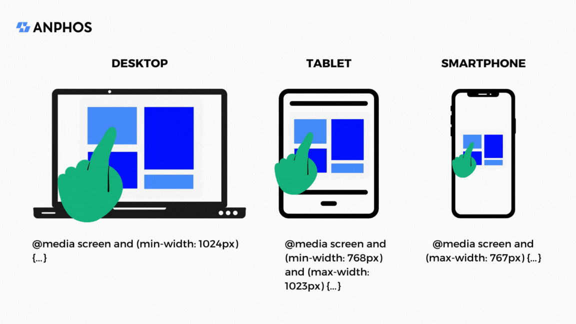
Breakpoints also guide the layout of the website. Their role is to define intervals according to page templates associated with categories of devices, such as smartphones, tablets, laptops and desktop screens.
Adaptive images
Thanks to CSS3, image size and resolution can automatically adjust according to available space. This optimizes visual quality while ensuring fast loading times.
Here are some formats to prioritize for:
- Logos: .svg (vector images)
- Images or illustrations: .tiff, .webp, .avif
- Complex images: .png
Use of CSS3 media queries
Media queries allow CSS3 style sheets to adapt based on the characteristics of the device used. This can include screen width, resolution, or even orientation.
With media queries, designers can define specific styles for each device for optimal content presentation.
Some criteria to know for configuring responsive design:
- Width = width of the display area in the browser;
- Height = height of the display area in the browser;
- Device-width = width of the device screen;
- Device-height = height of the device screen;
- Orientation = display in portrait or landscape modes of screens;
- Aspect-ratio = a ratio between the width and height of the display area (e.g., "16/9" for a 16:9 screen).
Some standard screen sizes to consider:
- From 480 to 720 px for mobile phones;
- From 768 to 900 px for tablets in portrait mode;
- From 900 to 1024 px for tablets in landscape mode;
- From 1024 to 1200 px for a fixed or portable computer.
Unified and structured code base
The fundamental concept of responsive design relies on using a single HTML code base identical for all devices. The main content of the site remains consistent, regardless of screen size.
The structure of HTML5 code is essential for responsive development. Using semantic tags <header>, <nav>, <main>, <section>, and <footer> helps organize content and facilitates understanding by search engines.
Mobile-First approach
Responsive design advocates for designing the site by prioritizing mobile devices, then gradually extending the layout for larger screens. This strategy ensures a smooth and seamless user experience, even on the most restricted devices.
CSS frameworks used by Anphos for Responsive Design:
- Bootstrap
- Tailwind CSS
- Foundation
Testing your website's responsiveness:
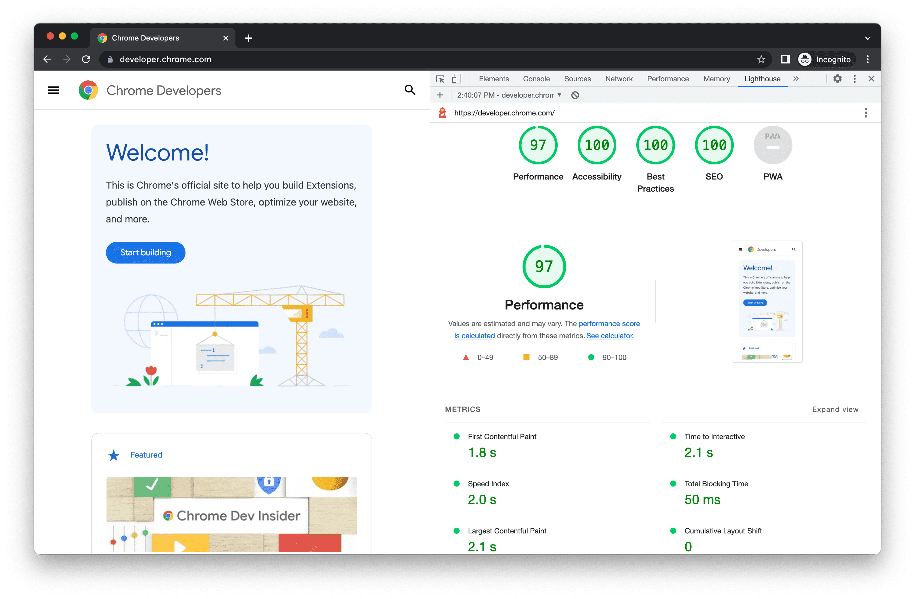
First, you can test your website using Google's Mobile-Friendly Test. The goal? To see if it meets responsive design standards.
Other responsiveness testing tools, like Chrome DevTools, Firefox Responsive Design Mode, and BrowserStack, also allow you to simulate different screen sizes and check your site's responsiveness.
These digital aids shed light on areas for improvement to ensure compatibility across a diverse range of devices.
For example, the testing process may reveal common issues, such as overlapping elements, images not resizing correctly, or navigation problems.
Fluid, adaptive, responsive... what's the difference?
Before the emergence of responsive design, a series of approaches were used to adapt the content of web pages according to various devices, including fluid and adaptive design.
These three approaches still coexist today, but it's important to distinguish between them.
Fluid design
Fluid design relies on a flexible and dynamic approach. Display adjusts based on percentages and proportions relative to the screen resolution. Content blocks (text, images, or videos) stretch or shrink fluidly, ensuring constant adaptability.
Adaptive design
Adaptive design is based on a more targeted technique by identifying the type of device used to access the content. Whether it's a smartphone, tablet, 14-inch or 17-inch laptop, or even a smartwatch, the design adapts accordingly.
While adaptive design offers faster display and a more pleasant user experience, it requires creating specific versions for each type of device. This method is therefore more demanding and requires constant vigilance to keep up with the rapid evolution of the device market.
Responsive design
Responsive design has emerged as a response to the challenges posed by the increasing diversity of devices. Unlike adaptive design, responsive design maintains the same content while dynamically rearranging the display based on screen size.
More practical and cost-effective, it ensures a consistent user experience and interface across different devices while avoiding the need to design and maintain multiple versions of the same site.
Mobile application: a smart alternative to responsive design
Some projects require specific features that are not easily achievable with responsive design. Think of complex interactions, sophisticated animations, deep integrations with phone features, and many other parameters.
In other cases, opting for this alternative concerns companies that want to offer their customers a more personalized experience or even more advanced interactions.
(+) More sophisticated ergonomics
Unlike a mobile website, a mobile application provides a more refined user experience.
Mobile operating systems (iOS, Android, Microsoft) use specific programming languages: Swift for iOS and Kotlin/Java for Android. These languages allow for fast loading times and, consequently, smooth navigation within the application.
(+) Interaction with phone features
The mobile application is designed to fully interact with your phone's features. Think of notifications that inform you of offers, real-time updates, GPS location, etc.
(+) Partial offline accessibility
Some mobile applications have the ability to work offline for certain features. Users can thus have continuous access to content even without a network, improving the availability and convenience of the application. However, this depends on the applications.
(-) Development cost and technical adaptations
Developing a mobile application requires technical adaptations based on the operating systems used (iOS, Android).
This diversity can lead to significant development and maintenance costs, especially if complex features are implemented. Moreover, regular updates for each operating system add a layer of complexity and expenses.
(-) Lack of natural referencing
Unlike websites, mobile applications do not benefit from natural referencing, meaning that the company must implement alternative communication strategies to increase the visibility of its application.
This lack of organic visibility thus leads to additional investments in promoting and advertising the application.
And Progressive Web Apps in all of this?
Progressive Web Apps (PWAs) are an emerging alternative to traditional mobile applications. They offer a hybrid approach that combines the benefits of websites and native applications.
More precisely, they are scalable web applications that offer a user experience similar to native applications while being accessible via a web browser.
(+) Use of Service Workers
PWAs use Service Workers, which are JavaScript scripts executed in the background and which enable offline access, caching, and push notifications.
(+) Offline accessibility
PWAs work offline thanks to caching necessary resources. They thus allow users to access certain features even without an internet connection.
(+) Reduced cost and development
Developing a PWA can be faster and more economical compared to developing a native mobile application, as only one version of the code is required.
(+) Easy installation
They can be accessed instantly via a browser, without having to go through the installation process of a native application.
(+) Simplified updates
Updates are managed automatically, avoiding the need to download and install them manually.
(+) Multiplatform compatibility
PWAs are supported by all modern browsers and different platforms. Compatibility issues related to operating systems are thus eliminated.
(+) Visibility on search engines
Unlike mobile applications, PWAs are indexable by search engines. Their visibility and SEO ranking can therefore increase over time and attract organic traffic.
(-) Limited functionalities
Although PWAs offer a wide range of features, they may sometimes have limitations in accessing platform-specific APIs.
Functionalities that heavily depend on hardware or software capabilities related to a device may not be fully usable within a PWA, such as biometric sensors, to name one example.
(-) Limited local storage
PWAs use local storage to cache resources and work offline. However, the amount of local storage available may be limited, restricting the ability to store significant data locally.
So, "mobile first" or "desktop first"?
The fundamental question is whether it is preferable to initially design a web design for a desktop computer or for a mobile device.
The "mobile first" strategy prioritizes users and mobile uses, and we believe it's the best approach to take.
Responsive degradation/retrofitting
At the origin of responsive design, it was common to start with a desktop version which is then adapted to mobile phones based on the decrease in resolution and screen size.
So, the transition from the desktop version to the mobile version is seen as a "degradation" or a progressive "retrofitting" from one to the other.
Still, keep in mind that smartphone or tablet users have variable speeds depending on whether they are at home or in public places. Moreover, the vast majority accesses the internet only via mobile, which sets the bar quite high in terms of loading time and display.
Graceful degradation and progressive enhancement
In the same vein, these two opposing approaches are frequently mentioned.
Graceful or elegant degradation implies that the design and functionalities are planned for the newest browsers, then adapted to older ones.
Conversely, progressive enhancement involves designing a design compatible with all browsers before enriching the display based on the user's equipment.
3 key points to remember
- Responsive design is the solution to absolutely consider to adapt the content of all your web pages to all types of devices and screens.
- Mobile applications are a very good way to bypass responsive design and gain efficiency, especially for e-commerce sites that would benefit from maximum visibility via app stores.
- PWAs are an interesting alternative to responsive sites and mobile applications due to their offline accessibility and time and development savings.